

Key Takeaways
- Dulux’s 2027 Colour Forecast balances darker, moodier tones with joyful, creative soft colours, giving homeowners more ways to create warmth, depth, and personality through timber finishes.
- Light Reflectance Value gives you a clearer sense of whether a colour is suitable for sun-exposed timber, with Woodhouse recommending an LRV of 45 or above for exterior use.
- The desire for darker colours needs to be weighed against heat and sun exposure, particularly on Weatherproof timber and sun-exposed Edgeline.
- Choosing the right finish is about finding a balance between the colour you want, where the timber is used and how much direct sun it receives.
- Good colour and design choices still need to account for the product underneath, with Weatherproof and Edgeline following different rules depending on exposure.
What the latest colour trends mean for timber applications
Dulux’s 2027 Colour Forecast is easy to get swept up in. 36 new colours across three palettes (Sensory, Play and Treasure), all bringing more depth and pushing into darker, moodier territory than the forecasts of recent years. They’re colour palettes that look easy to picture everywhere, from the fence and front door to the skirting boards and the lot.
However, not every one of those 36 colours belongs on every surface. Buried in each colour’s own product data is a number that matters more than how the swatch looks under gallery lighting: its Light Reflectance Value, or LRV. On timber, that number can be the difference between a colour that lasts and one that cracks.
This article looks at what the 2027 forecast means for timber in general, but more specifically for our two Woodhouse ranges. Weatherproof is built for full exterior exposure, while Edgeline is designed for the inside of the house. They follow very different rules, and as we’ll get to, “indoors” doesn’t always mean what you’d think.
For more detail on the LRV 45+ requirement and painting Woodhouse products correctly, see our Woodhouse Painting guidance.
What is LRV and why does it matter more on timber?
Light Reflectance Value, or LRV, is a number between 0 and 100 that shows how much light a colour reflects, with higher numbers reflecting more light and lower numbers absorbing more light and heat.
This matters on timber because darker colours can make the surface much hotter in direct sun, and that extra heat puts more stress on the timber as it expands, contracts and responds to changing temperatures over time.
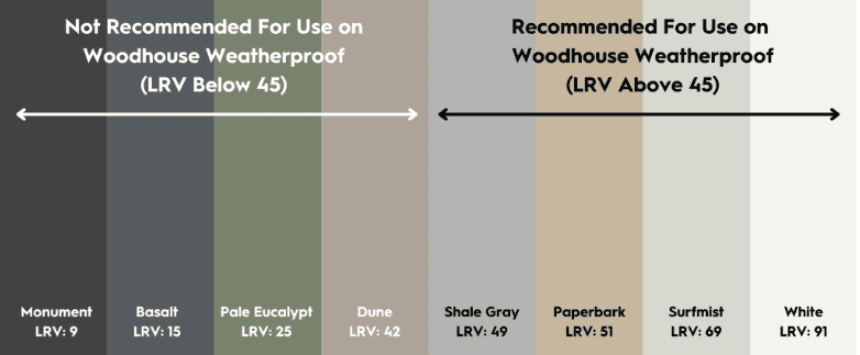
For exterior timber, Woodhouse recommends topcoat colours with an LRV of 45 to 100. Colours at 44 or below can generate higher surface temperatures, increasing the risk of surface checking, shrinkage, distortion and resin bleed.
That doesn’t mean there’s anything wrong with the colour or the paint itself, just that darker surfaces absorb more heat, and timber reacts to that over time.
Dark colours still have a place on the outside of your home
The LRV guidance applies to painted timber, not to the exterior of the house as a whole. Dark colours can absolutely be used on other elements, such as render, aluminium frames, and metal roofing or downpipes. These materials dissipate heat differently and aren’t affected by the same expansion, contraction and resin bleed that timber is. So if you love a moody 2027 shade, you can still bring it to the outside of your home. You just need to consider which surface it’s going on.
Two Woodhouse ranges, two different rules
Timber’s appeal has always been its versatility. It can frame a house, clad it, trim it and floor it, adapting to almost any job because it can be engineered and treated for the conditions it’s going into. But that versatility only holds if the right product goes in the right place. Not every timber range is built to handle the same exposure, and colour is just one layer on top of a bigger decision that starts with matching the product to the job.
Weatherproof is built for full weather exposure: cladding, fencing, decorative exterior joinery, anything that sits in the sun and the rain all year round. This is where the LRV 45+ rule applies strictly. Below that line, a Weatherproof board is battling heat it wasn’t specified for.
Edgeline, by contrast, is built for the inside of the house: skirtings, architraves, feature walls, window and door trim. Out of direct sun, none of the heat-driven risk that affects Weatherproof timber applies. A dark, moody Edgeline skirting isn’t absorbing hours of concentrated sunlight the way an exterior board is.
In practice, it’s pretty straightforward. If you’re choosing a colour for exterior timber, it’s worth checking the LRV before you order. With Edgeline indoors, you’ve got far more freedom, including with some of the darkest, moodiest shades in the 2027 forecast. However, there are a few things to keep in mind…
The indoor exception when it comes to choosing your paint colour
A windowsill, a reveal, or a run of trim that sits behind glass and catches hours of direct sun every afternoon can get just as hot as an exterior board, sometimes hotter, thanks to the greenhouse effect of the glass concentrating that heat into one small, unventilated spot.
If that surface is painted in a colour with an LRV of 44 or under, it can face exactly the same checking, shrinkage, distortion and resin bleed as an exterior Weatherproof board out in the weather. Technically it’s Edgeline, technically it’s indoors, but thermally, it’s living the life of an exterior board.
The real rule of thumb, then, isn’t indoor versus outdoor. It’s shaded versus sun-exposed. A north- or west-facing windowsill that bakes all afternoon plays by the exterior rules, whatever range the timber is from.
A practical way to test it is if a spot gets warm to the touch on a summer afternoon, treat it like an exterior surface and check the LRV before you commit a colour to it.
The full Dulux Colour Forecast 2027, checked colour by colour
With that in mind, we’ve gone through all 36 colours in Dulux’s 2027 Colour Forecast across the Sensory, Play and Treasure palettes and checked each one against the LRV published on its Dulux colour page.
The outdoor verdict below is based on exterior timber, with Weatherproof in mind. Green means the colour is suitable for outdoor use, amber means it’s worth checking with your supplier first and red means it’s best kept inside.
And as above, those same rules apply to Edgeline anywhere it’s exposed to strong, direct sun, even if it technically sits indoors.
The 2027 Colour Forecast: LRV & Outdoor Suitability
All 36 colours from Dulux’s 2027 Colour Forecast (Sensory, Play, Treasure), with LRV and colour-specific guidance pulled directly from each colour’s individual page on dulux.com.au. Each page gives you exact colour information, including the LRV we’ve used below.
Woodhouse Timber guidance for painted timber puts the safe cut-off for exterior use at LRV 45 and above.
Play Palette
Play is the most expressive of the three palettes, mixing soft pastels with richer berry tones, orange, blue and green. It feels lighter and more playful, with enough deeper shades in the mix to stop it feeling too sweet.
On timber, many of the pastels and whites comfortably clear the exterior LRV threshold, while the darker accent colours are generally better suited to feature walls, doors and joinery indoors.
| Play Palette | |||||
|---|---|---|---|---|---|
| Swatch | Colour | Palette | LRV | Best suited for… | Outdoor verdict |
| Rich Loam | Play | 8 | A rich, earthy brown built for grounding, cosy interiors. Skirtings, architraves or a feature wall, not a deck or fence board. | High risk outdoors | |
| Tranquil Retreat |
Play | 59 | A soft, calming mid-tone that sits comfortably above the exterior threshold, making it one of the more flexible choices in the forecast for outdoor use. | Exterior-safe | |
| Albeit | Play | 12 | A rich, moody navy that’s made for the drama of an interior feature wall, door or joinery detail — not a colour to put on sun-exposed timber, however good it looks in the swatch. | High risk outdoors | |
| Powder Blue | Play | 63 | A calming pale blue that clears the threshold with room to spare. Safe for exterior trim or walls as well as interior schemes. | Exterior-safe | |
| Canary Wharf |
Play | 40 | A muted, greyed-off blue that reads well in a bathroom or study. Sitting five points under the usual exterior cut-off, it’s worth checking with your timber supplier before committing to it anything sun-exposed. | Borderline | |
| Natural White |
Play | 85 | The lightest of Dulux’s warm whites and one of the safest exterior picks in the whole forecast, comfortably suited to main walls or exterior features. | Exterior-safe | |
| Stately Frills Half |
Play | 65 | A soft, muted purple suited to bedrooms and living spaces. Well clear of the threshold, so it holds up outdoors too if the mood calls for it. | Exterior-safe | |
| Spring Fever | Play | 77 | A bright, reflective yellow suited to sunny, south-facing rooms. Its high LRV means it’s just as safe as an exterior colour as it is inside. | Exterior-safe | |
| Catnap | Play | 53 | A versatile mid-tone green suited for both indoor and outdoor use. The LRV backs that up, sitting comfortably above the 45+ line. | Exterior-safe | |
| Blue Glass | Play | 43 | A soft, greyed blue that leans calm rather than dramatic. Two points under the usual exterior threshold, so treat it as a check-first colour rather than an automatic yes for cladding or a deck. | Borderline | |
| Baca Berry | Play | 18 | A deep, dusty-rose tone built for a moody, intimate feature wall. Well under the cut-off, so better used as an accent wall inside rather than exterior joinery. | High risk outdoors | |
| Temptress | Play | 18 | A deep, warm burnt orange that works as a striking front colour. Striking indoors, but too dark by the LRV rule for a sun-exposed exterior door or trim. | High risk outdoors | |
Sensory Palette
Sensory is Dulux’s softer, more grounded palette, built around yellow-greens, warm neutrals and deep browns. Inspired by Japanese craftsmanship, it feels calm and considered without being too restrained, making it easy to use across everyday spaces.
On timber, there’s a good mix of lighter neutrals that comfortably clear the exterior LRV threshold, alongside deeper greens and browns that are better kept indoors.
| Sensory Palette | |||||
|---|---|---|---|---|---|
| Swatch | Colour | Palette | LRV | Best suited for… | Outdoor verdict |
| Buttercookie | Sensory | 47 | A warm, easy neutral that earns its “inside or out” billing. It comfortably clears the exterior threshold, making it a low-risk pick for cladding, a feature fence or outdoor furniture, as well as interior trim. | Exterior-safe | |
| Moorland | Sensory | 44 | A soft grey-green that works beautifully on walls or trim, inside or out. At just one point under the usual exterior cut-off, though, it’s worth checking with your timber supplier before committing to a full deck or cladding run. | Borderline | |
| Field Maple | Sensory | 27 | A muted, mid-tone olive green that works well across interior and exterior spaces. It sits well below the 45+ threshold though, so it’s better suited to trim and joinery than sun-exposed cladding. | High risk outdoors | |
|
White Dune Half |
Sensory | 84 | A warm, versatile white with plenty of headroom above the 45+ threshold. It works well as a main wall colour indoors and doubles just as easily as exterior trim. | Exterior-safe | |
| Ecru | Sensory | 68 | A warm neutral with a soft greenish undertone that comfortably clears the exterior threshold. A safe, brightening choice for main walls whether it’s going inside or out. | Exterior-safe | |
| Humble Fawn | Sensory | 56 | A soft, warm beige that sits well clear of the 45+ cut-off — a flexible backdrop for interior or walls that also holds up fine on exterior surfaces. | Exterior-safe | |
| Dieskau | Sensory | 62 | A warm greige with a mauve undertone that clears the threshold easily — reads as at home on an exterior wall or trim as it does inside on a Hamptons-style scheme. | Exterior-safe | |
| Blue Balm | Sensory | 47 | A soft, greyish light blue that just clears the 45+ line. Fine for exterior work, though its margin above the threshold is narrower than the lighter neutrals in this palette. | Exterior-safe | |
| Barite | Sensory | 26 | A warm, earthy brown and a grounding neutral. Well under the exterior threshold, so it’s a trim, joinery or feature-wall colour rather than one for sun-exposed timber. | High risk outdoors | |
|
Spinach Green |
Sensory | 11 | A deep, muted green that pairs nicely with lighter neutrals as an accent. At LRV 11, it’s squarely an interior colour on timber, not one for a fence or cladding run. | High risk outdoors | |
|
Sweet Chocolate |
Sensory | 9 | A dark, warm neutral built for a grounding, cosy interior. Nowhere near the exterior cut-off, so keep it to skirtings, architraves or a feature wall. | High risk outdoors | |
| Dark Cocoa | Sensory | 7 | One of the darkest neutrals in the whole forecast. A striking interior feature colour, but an easy one to rule out for anything sun-exposed. | High risk outdoors | |
Treasure Palette
Treasure is the richest of the three palettes, bringing together deep jewel tones like Madonna and Raspberry Fool with softer golden neutrals such as Gentle Sands and Warm Woollen. It feels warm, layered and a little more lived-in, with colours that add character without feeling overly polished.
On timber, the lighter neutrals and warm whites are the stronger exterior options, while the deeper jewel tones are generally better kept indoors and away from direct sun.
| Treasure Palette | |||||
|---|---|---|---|---|---|
| Swatch | Colour | Palette | LRV | Best suited for… | Outdoor verdict |
|
Snowy Mountains Half |
Treasure | 86 | A very light, airy neutral and is as safe as it gets for exterior timber, with plenty of headroom above the 45+ threshold. | Exterior-safe | |
| Precision | Treasure | 6 | The darkest and most dramatic colour checked so far. A striking choice for skirtings, architraves or a statement door inside, but squarely an indoor-only colour on timber. | High risk outdoors | |
|
Rich Red Violet |
Treasure | 10 | A rich, warm purple-red that adds drama to a room. One of the darkest colours checked so far, and an indoor-only choice on timber. | High risk outdoors | |
| Bone White | Treasure | 73 | A luminous, warm white that’s an easy base for most interior styles. Comfortably clears the threshold, so it works just as well as a main exterior wall colour. | Exterior-safe | |
|
Raw Cotton Quarter |
Treasure | 83 | An elegant warm neutral with a red undertone, suited to main walls inside and out. The high LRV backs that up as a safe exterior choice. | Exterior-safe | |
| Gentle Sands | Treasure | 69 | A warm, sandy yellow suited to bright, sunlit spaces. Clears the exterior threshold easily, making it a solid pick for a sun-facing wall or trim run. | Exterior-safe | |
| Pelican Pink | Treasure | 49 | A soft, warm peach-pink suited to bedrooms and living spaces. Just above the 45+ line, so it’s a workable, if not the widest-margin, exterior option. | Exterior-safe | |
|
Warm Woollen |
Treasure | 49 | A deeper yellow with green undertones that works as a feature colour inside or out, the LRV agrees, sitting just clear of the threshold. | Exterior-safe | |
| Plunge | Treasure | 11 | A deep teal-blue built for drama. Well under the cut-off, so it’s a feature-wall or joinery colour rather than one for exterior cladding. | High risk outdoors | |
| Murray Red | Treasure | 9 | A warm, brownish red suited to formal living spaces and entries. Too dark by the LRV rule to risk on sun-exposed exterior timber. | High risk outdoors | |
| Madonna | Treasure | 9 | A dark, moody blue-grey with real drama for an interior feature, one of the darkest colours in the whole forecast, and an indoor-only pick on timber. | High risk outdoors | |
|
Raspberry Fool |
Treasure | 12 | A deep, saturated pink used for softness or drama depending on how it’s applied — well under the exterior threshold, so treat it as a feature-wall or joinery colour rather than one for sun-exposed timber. | High risk outdoors | |
How to use this table
Using Weatherproof outdoors (cladding, fencing, exterior joinery): read the verdict column directly. Stick to the greens, treat ambers as a five-minute check with your painter or Woodhouse dealer before ordering a full run, and rule out the reds altogether.
Using Edgeline indoors, away from direct sun (skirtings, architraves, a feature wall): the verdict column doesn’t apply here, and virtually every 2027 colour is fair game, including the darkest Treasure tones.
Using Edgeline somewhere that gets harsh, direct sun (a windowsill, a reveal, a glazed trim run): treat it exactly like a Weatherproof job and read the same verdict column before committing.
Common questions
Can I use a dark 2027 colour outdoors at all?
Yes, darker colours can often be achieved on products that are better at dissipating heat, such as aluminium frames or rendered walls. The LRV risk only applies when painting timber. Below an LRV of 45, the board absorbs more heat than exterior-grade timber is built to handle, and orientation makes it worse, as the same dark colour runs hotter on a north- or west-facing elevation than it would somewhere shaded. If you’re planning a dark colour on timber, get case-by-case advice from your timber supplier or painter before committing to a full run.
Does this only apply to Woodhouse products?
Not necessarily. LRV is tied to the colour itself and how much light and heat it absorbs, so the same general principle can apply to painted timber more broadly. In this article though, we’re looking specifically at Woodhouse’s Pre-Primed Weatherproof and Edgeline ranges, using the 45+ LRV guidance provided for those products in Australian conditions.
Is LRV the same as UV resistance?
No, although they’re easy to mix up. LRV is about how much light and heat a colour absorbs, which affects how hot the timber can get. UV resistance is about how well a colour holds up against fading from sunlight. A paint can have good UV resistance but still have a low LRV, so the two are worth considering separately when choosing a colour for exterior timber.
Make an expressive palette last on timber with a little extra care
Colour trends are heading darker and moodier, with plenty of palettes that look fresh while bringing more warmth, richness and personality into a space. But a good colour choice on timber comes down to where the light falls, not just how the swatch looks.
Two things matter more than anything else. Check the LRV and think about sun exposure rather than a simple indoor-versus-outdoor split. Getting that combination right gives your timber a much better chance of looking freshly painted for years, rather than needing attention sooner than expected.
And if the darkest shades in the forecast are calling to you, there’s no need to give them up. Use them on render, aluminium frames or interior joinery, and keep your exterior timber to LRV 45 and above.
Before you commit a 2027 colour to an elevation, a fence line or a sun-trapped windowsill, talk to your local Woodhouse dealer. A quick check now is a lot cheaper than a re-coat later.